UX audit is a 5-day process that allows you to find every issue in your app that decreases your conversion rate. Quickly, and at low cost. Prioritized issues allow you to begin with the bugs that have the highest impact on your ROI. Discover the power of UX audit on the CMC Markets example. During the 5 days of thorough analysis, our team spotted 5 critical issues in this fintech app that were causing major user leaks.
A QUICK SUMMARY – FOR THE BUSY ONES
TABLE OF CONTENTS
Even though so many business owners understand the power of UX design, there are still lots of apps that somehow don’t leverage its best practices. If you’re struggling with unsatisfied users or user leaks, taking care of the UX is the way to go.
5 days — it’s how much time you need to check how an app is performing, as well as spot problems that cause confusion and make users leave the app. 5 days — it's how much time is needed to perform a UX audit.
Let us now demonstrate how quickly a UX audit can identify why your users are dropping off. We’ll walk you through a real UX audit in the following paragraphs.
Keep scrolling to see what UX flaws we found in one of the online trading platforms that are so popular right now.
When it comes to UX design, fintech apps are an especially interesting case. No other industry requires as much user trust as online financial services. UX covers that on various stages, but even small inconsistencies, confusing messages, or lack of messages can negatively impact how users feel.
Trust can be quickly undermined by even the smallest inconsistencies.
Imagine you’re accessing a new online trading app. How would you feel if you saw the same functionality named very differently in various places in the app?
It’d feel sketchy wouldn’t it?
Your users are similarly sensitive and suspicious towards new and unrecognized. They expect consistency and are accustomed to certain interactions. Lack of clarity or inability to perform expected actions raises frustration and undermines trust.
That’s why the CMC Markets seemed to be an interesting case to analyze. The app has many bad reviews that mention bugs, as well as problems with logging in and completing certain actions.
Let’s see what UX flaws cause such an impression by going through the UX audit of the CMC Markets app.
A UX audit process can be squeezed into 3 steps that allow designers to reveal the app’s flaws. Let’s explore this process based on the CMC Markets’ case.
We aren’t affiliated with CMC Markets, so we didn’t have access to statistics and data about the users and the app itself. Therefore, we needed to make some assumptions based on our experience as UX designers and previous similar fintech projects we’ve been a part of.
During the preparation phase, it was important to identify users and their goals.
<span class="colorbox1" fs-test-element="box1"><p>Why do we need to establish user goals?</p><p>To be able to spot potential errors we need to know how users are navigating through the app, what is important for them, and what steps they’ll need to make. Empathy will allow you to put yourself in someone else's shoes and sense where a user is confused, frustrated, or makes mistakes.</p></span>
In a trading app like the CMC Markets, users have a few essential goals:
This time we focused on speed.
Nielsen Heuristics constitute a bare minimum of best practices every digital product should follow — it’s the quickest way to get an overview of the product’s UX condition.
The Nielsen Heuristics rules state, for example, that the design should keep users informed about what is going on or that users need control, and freedom, and clearly marked “emergency exits” in case of mistakes.
Nielsen Heuristics constitute a starting point for each UX analysis and often are adapted or broken down into details to fit a specific product. For this case, using 10 heuristics was enough to spot both minor and critical errors in the app.
We carefully clicked through each screen, stepping in a user’s shoes.
Taking notes of everything that looked wrong was the first step.
We were looking for all sorts of confusion:
The second step was to compare each issue to the list of heuristics. Sometimes one error can violate more than one heuristic.
Note: In UX audits made with the whole set of data and access to real users, it’s crucial to perform usability tests at this point. Something that’s correct from a design good practices perspective, may not be correct from the specific user group.

After an account is created, a user expects to be logged in automatically. Derogation from that rule and the necessity to log in again causes confusion. The worse it gets is that it happens during the first contact with an app. Users can perceive it as problems with logging in or some error, which will cause frustration.
The fact that the feature behaves like that also violates one of the Heuristics — the rule of consistency and standards, which implies doing what the user expects and following platform and industry conventions.
<span class="colorbox1" fs-test-element="box1"><p>Business risk: Making users feel confused and frustrated right at the very first contact with an app jeopardizes their trust and raises some red flags in their minds. Trust, confidence, and a sense of security are especially important in fintech apps. Lack of that can result even in opting out.</p></span>
During the analysis of the CMC Markets app, it turned out that the app hasn’t been using the UX potential to the fullest. What’s more, it turned out that there are 2 critical problems in the app that have the power to seriously decrease the conversion rate.
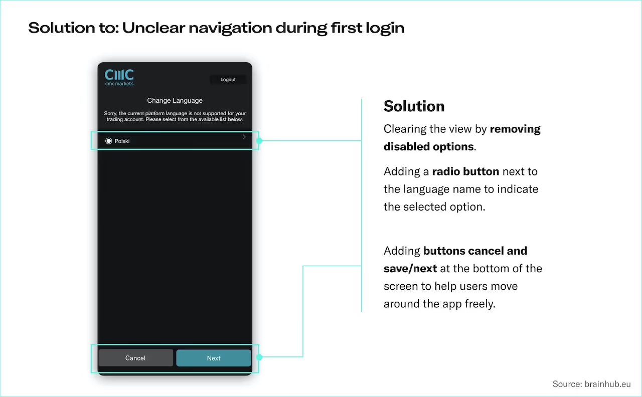
The first critical flaw shows up already during the first login.
Right after creating the account, users are prompted to select the language. It’s not clear how to do that, because some languages are grayed out and seem to be disabled. Clicking the language name does nothing. The only visibly clickable button is for logout.
Classification: critical problem. This issue prevents users from making action and will most likely result in leaving the app. This issue should be fixed at the highest priority since it decreases the conversion rate.

Users are confused and frustrated — there is no simple indicator of what to do next.
That kind of error undermines the trust in the app. Users may perceive the app as not serious. Some of the users will drop the app and will be discouraged from using it again. The app will lose some users immediately after creating an account because of an easy-to-fix error.
Another serious issue in the CMC Markets app is related to error messages.
After using the app for a while, an unreadable error message appeared on the screen. It was difficult to decipher and there was no instruction on how to recover from error.
Classification: critical problem. This issue prevents users from making an action and will most likely result in leaving the app. This issue should be fixed at the highest priority, since it decreases the conversion rate.

When errors occur it’s important to provide users with clear and simple messages about what happened and how to recover. Otherwise, they feel confused, frustrated, and lose trust in the app.
That kind of error impacts the conversion rate since some of the users will drop using the app after seeing a strange, unreadable error screen. It is especially hurtful in fintech apps since that breaks users’ sense of security in terms of the safety of their money. Users are losing trust in the app, and some of them will drop it and be discouraged to use it again.

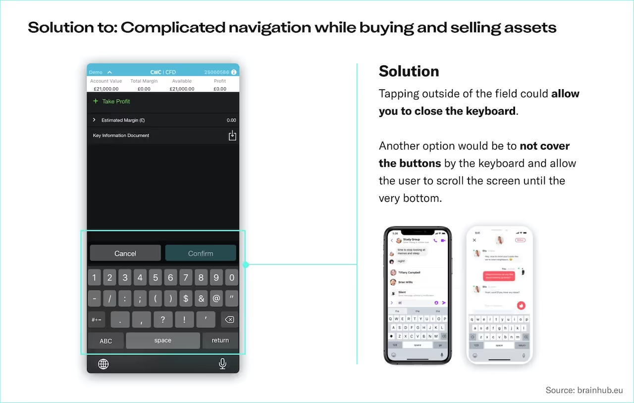
The next problem appears during the process of buying and selling assets. After clicking on the input button, there is no easy way to hide the keyboard. A user can’t easily proceed with a task and the keyboard covers the buy button.
Classification: serious problem. This issue blocks a user. A workaround can be found, but it causes frustration. The issue needs fixing as a high priority, since it may seriously affect the conversion rate.

The lack of ability to close the keyboard can be perceived as a serious bug. Users need to figure out how to hide it, and some of them won’t be able to complete the task.
Buying and selling assets is the key functionality of the app. Users won’t be able to proceed with an action, so many users will stop using the product. Users’ trust is once again violated, and the app’s credibility drops. An easily-fixable issue like that results in user leaks and dropping conversing rates. It’s a serious issue considering the level of security and confidence fintech apps need to provide, and the fact that it’s a key functionality.
Tabs for selling and buying assets are not distinct enough. Users don’t have a clear understanding on where they are at the moment. Users are at risk of proceeding with a transaction that wasn’t intended.
Classification: serious problem. This issue blocks a user. A workaround can be found, but it causes frustration. The issue needs fixing as a high priority, since it may affect the conversion rate.

Users are confused about where they are in the app right now. It’s especially a problem for new users who are not accustomed yet to how the app works and get discouraged.
Users may accidentally perform an action they don’t intend, which is a huge problem and impacts negatively not only the credibility of the app but also the whole company.

The third serious problem during buying and selling assets is connected to navigation. Going back to the previous view from the action of buying/selling, especially when the keyboard is open.
Classification: serious problem. This issue blocks a user. A workaround can be found, but it causes frustration. The issue needs fixing as a high priority, since it may affect the conversion rate.

There is no clear indication of how to close the view and go back, which confuses a user. Users are accustomed to certain interactions in a mobile app, like relying on swipe movements when there’s no button for going back. When all of these options are missing, the app may be perceived as broken.
Users may perceive the app as non-working, which may lead to losing trust or even stopping using the app at all.

In the CMC Markets app, serious issues appear during the first login, right after creating an account, and while using the key functionality of the app — buying and selling assets. It seems to be a big negligence. Problems with these two functionalities seriously affect the app’s credibility and are the cause of dropping the app and not using it again.
Auditing the app and making a few UX improvements would allow CMC Markets to:
What the app needs now, is usability testing and a few weeks of work from UX designers and software developers.
Normally, usability testing is a key step of each UX audit. To prepare an audit, we also use real app statistics and information about users — which allows us to investigate it even more thoroughly. The whole document contains the description of the methodology and each error along with improvement tips.
UX audit is the quickest, budget-friendly tool to boost an app’s ROI in uncertain times. If you want to improve your product quickly with a 5-day process, let's talk.
Our promise
Every year, Brainhub helps founders, leaders and software engineers make smart tech decisions. We earn that trust by openly sharing our insights based on practical software engineering experience.
Authors
UX/UI designer with 8 years of professional experience. With background in psychology.
Software development enthusiast with 7 years of professional experience in the tech industry. Experienced in outsourcing market analysis, with a special focus on nearshoring. In the meantime, our expert in explaining tech, business, and digital topics in an accessible way. Writer and translator after hours.
Read next
Popular this month
previous article in this collection
It's the first one.